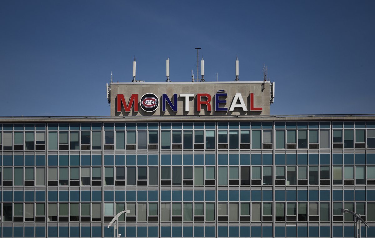
Since last Saturday, the nameplate at the top of the Montreal airport terminal shines in alternating red, white and blue. And to underline the importance of ice hockey, the O has been stuffed with the “Canadiens” hockey logo. Gohabsgo !

It is an internal idea, they say. Yes, I can see that from a distance. Unfortunately.
![]() When branding goes wrong
When branding goes wrong
This is exactly what can happen in any company, when the average guy or girl in a company thinks he or she has great design skills or is good at marketing. After all, design and marketing are not exact sciences, and it is nice to be creative. So, why not? Next, he or she plays a little bit around with some colours and symbols, combines a few unflattering tryouts and… comes up with the Kindergarten creation of the year. Bingo.

Bleu blanc rouge !
“Bleu Blanc Rouge” – I know these are the colours of the “Canadiens” – but this colour combination does not make me think of Canada at all. It is the “tricolore” of countries like France and the USA. When you arrive in Canada, you do not expect the US national colours to welcome you. You rather expect “red and white”, as in the beautiful Maple Leaf. But the internal team must have thought, let’s make it a bit more colourful. Why not.
“We wanted to stay within limited budgets”.
Really? Les excuses sont faits pour s’en servir.
“We wanted to stay within limited budgets”, is what usually comes as a very weak excuse when internal creations are being criticised.
It is a common misunderstanding that professional design is expensive. Why would it be expensive? Why would an update of an airport sign need to be expensive? It just requires a few people to give it some professional thought… and a few tryouts.
It is a very noble idea to stay within budgets. The challenge, however, is to create great design within limited budgets. And that is perfectly well possible. There are plenty of ways to do so.The minimum you need is a few people with a clue on design and city marketing. That’s all.
Producing an unprofessional sign costs at least as much as producing a professional one. The difference is in the hours of a few professionals coming up with a design that rocks. But remember that internals do not work for free either. Their jobs are on the payroll. So, it is not for free or cheap after all. It only looks cheap. And it may hurt your brand. The cost of brand dilution or brand damage is difficult to calculate.
To conclude: Montreal, you deserve much much better !
