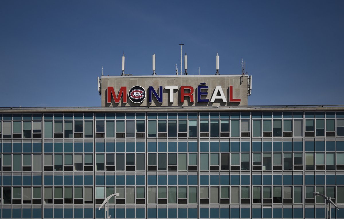
Since last Saturday, the nameplate at the top of the Montreal airport terminal shines in alternating red, white and blue. And to underline the importance of ice hockey, the O has been stuffed with the “Canadiens” hockey logo. Gohabsgo ! It is an internal idea, they say. Yes, I can see that from a distance.…